In today’s dynamic organizational landscape, working with intricate datasets has become common. The ability to deal with these vast pools of information into concise summaries while extracting their underlying patterns is crucial for informed decision-making.
Enter data visualization – a powerful ally in this endeavor. In the following article, we will delve into the realm of Python Visualization, exploring its graphing capabilities and understanding its potential to unlock insights from data.
For more industry skills insights : Data Science Skills Report 2024
What is Data Visualization?
Understanding data coming through a table can prove difficult, especially with large datasets that cannot be viewed simultaneously. Thus, explaining the same information in a pictorial format makes comprehension much easier; this process of converting raw data to visuals is known as data visualization.
Visualizing the relationship between different data pieces becomes much more manageable. Various types of graphs facilitate data visualization. However, the selection of graphs depends on several factors. Let’s discuss this further, but before that, a short note-
Explore our signature data science courses and join us for experiential learning that will transform your career. We have elaborate courses on AI, ML engineering, and business analytics. Choose a learning module that fits your needs—classroom, online, or blended eLearning. Check out our upcoming batches or book a free demo with us. Also, check out our exclusive enrollment offers
Types of Graphs for Data Visualization
Graphs and the information they convey can depend on various factors. The following are the most common ways of categorizing graphs.
-
Business-Driven vs. Data-Driven Graphs
Business-driven graphs visualize the decision-making process and other business-related workflows such as standard operating procedures, supply chains, etc. SWOT analysis, fishbones, and flow charts are common business goals.
On the other hand, data-driven graphs use the various data generated by the business to represent it visually. Such graphs are commonly used as they allow businesses to understand what is happening inside and around the organization, enabling them to make data-based decisions.
-
Types of Data-Driven Graphs
There is a variety of business-driven graphs out there. However, before discussing them, you must know that data comprises numerical and categorical variables. Numerical variables generally contain discreet or continuous numbers, whereas categorical variables have various classes or groups and often have character data types. Now, let’s focus on the different types of data-driven graphs.
1. Distribution Charts
Distribution charts help users understand how data is spread and varies. Common distribution charts are histograms, boxplots, KDS plots, etc.
2. Trend Charts
Trend charts help you understand how values change over time. Common trend charts are line charts, area charts, etc.
3. Comparison Charts
Comparison chats allow you to assess the relationship between two variables. As variables are either numerical or categorical, the relationship can be created in the following combination.
- Numerical – Numerical columns
Charts that assess the relationship between two numerical columns are scatterplots, bubble charts, heatmap, etc.
- Numerical – Categorical columns
Several charts, such as bar and pie charts, assess the relationship between a numerical and a categorical variable.
- Categorical – Categorical Columns
A Venn diagram can be created to assess the relationship between two categorical columns.
4. Contribution Charts
The contribution chart explains the proportion of different data segments to the whole. Common contribution charts are tree maps, frequency bar charts, frequency pie charts, and 100% stacked bar charts.
5. Other Charts
Various other kinds of charts use different types of data, such as maps, word clouds, spectrograms, etc.
-
Univariate vs. Bivariate vs. Multivariate Graphs
Data-driven graphs can also be categorized based on the number of variables involved.
1. Univariate Plot
A univariate chart uses only one variable. Common univariate charts are histograms, boxplots, and KDS plots.
2. Bivariate Plot
In a bivariate plot, only two columns are involved. Bar charts, pie charts, and scatterplots are common examples of bivariate plots.
3. Multivariate Plot
When three or more variables are involved in the creation of a plot, then it is known as a multivariate plot. Some of them are grouped bar charts, bubble charts, etc.
Note that all the above graphs can have univariate, bivariate, and multivariate versions, which we will explore.
Let’s discuss the libraries you can use to create such graphs in Python.
Visualization Libraries in Python
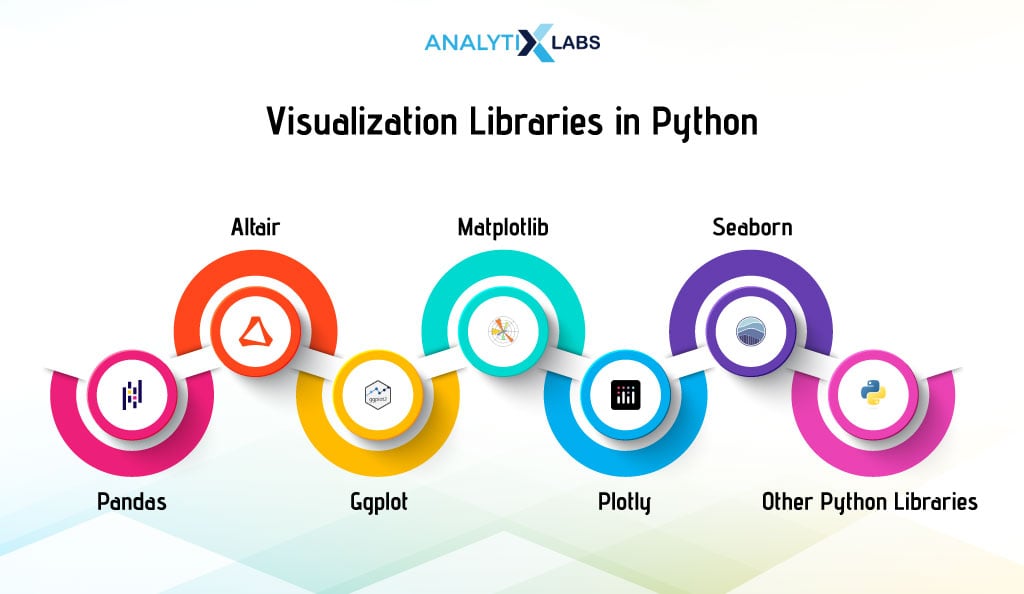
Numerous libraries in Python can be used to visualize data. Some of the most prominent ones are as follows-
-
Pandas
Pandas is a library commonly used for data manipulation. However, it also allows you to visualize its data. The ‘plot’ attribute available for Pandas Series and Dataframe allows users to create different graphs quickly. Creating plots using Pandas is quick and easy and should be used to create simple graphs using Pandas data quickly.
-
Matplotlib
Matplotlib is the most crucial and versatile visualization library of Python. It allows users to create a variety of 2D plots with ease. The biggest benefit of Matplotlib is that it can make charts created using Pandas or Seaborn more aesthetically appealing.
-
Seaborn
Seaborn is a powerful library that can easily perform complex and statistical visualization. It can work with complete datasets and, unlike Matplotlib, considers them a solitary unit, making it great for analyzing datasets. Compared to Matplotlib, it is much more organized and requires fewer commands.
-
Altair
The next common visualization library is Altair. It has a declarative syntax and integrates well with Pandas, making it highly user-friendly. It can also be used for interactive visualization. However, it has a much smaller community size than the other three libraries discussed above.
-
Ggplot
Ggplot is a great library, and its version, ggplot2, is commonly used in R. It is the Python implementation of the grammar of graphics. It, too, has a declarative syntax and a layered approach, making it easy and versatile to use.
The issue with it is that it is more integrated with the data structures of R, making it aloof from Python’s ecosystem of visualization libraries, such as Pandas, Matplotlib, Seaborn, etc. Thus, it is less preferred to be used with Python.
-
Plotly
Plotly is a browser-based visualization library that supports user interaction and 3D graphics. While it is commonly used for creating complex graphs, it is avoided when relatively simple statistical graphs are to be created where interactivity is not the objective. Also, it is not so much integrated with the other prominent visualization libraries of Python.
-
Other Python Libraries
Many other visualization libraries in Python allow you to do a range of things, such as visualizing large or streaming data or creating interactive dashboards.
Now, let’s focus on introducing yourself to some visualization in Python. The section below explains a few fundamentals about visualization in Python and introduces you to the data we will use.
Introduction to Python Data Visualization
Before we start creating different kinds of graphs in Python, we will discuss a few basic things, as these will help you understand the code in the next few sections.
-
Fundamentals of Python Visualization
Most of the visualization in Python uses the trio of Pandas, Matplotlib, and Seaborn; therefore, we will create most of the graphs using these libraries. We will also create the same graph using these three libraries so that you can understand how their syntax differs. However, there are a few things that you need to know when using this trio.
i. Role of Matplotlib in Adding Aesthetics
The important thing to know here is that these three libraries have an ecosystem. Often, the data required to create the plots using Matplotlib or Seaborn will be created using data manipulation functions from Pandas.
Matplotlib will create the graphs’ aesthetics using any of the three libraries. This means that even when creating a plot using Matplotlib or Seaborn, we will use Matplotlib to set the title, x, and y labels, show the graph, and manipulate other aesthetic aspects.
Therefore, you will see a lot of Matploltlib code even when the graphs are created using other libraries. Also, this article will focus more on showing you the code that creates the graph rather than the aesthetic code of Matplotlib, as it will get repetitive and obvious after a while.
ii. Ways to Aggregate Data
It is important to remember the format when preparing data for visualization libraries like Seaborn and Matplotlib. Seaborn and Matplotlib often require long formats, while Pandas typically need wide formats. Pandas may also require retaining levels during aggregation.
Seaborn and Matplotlib benefit from resetting the index to avoid counterproductivity. This leads to using functions like groovy () for long-format data and pivotable () for wide-format data during aggregation.
-
About Data
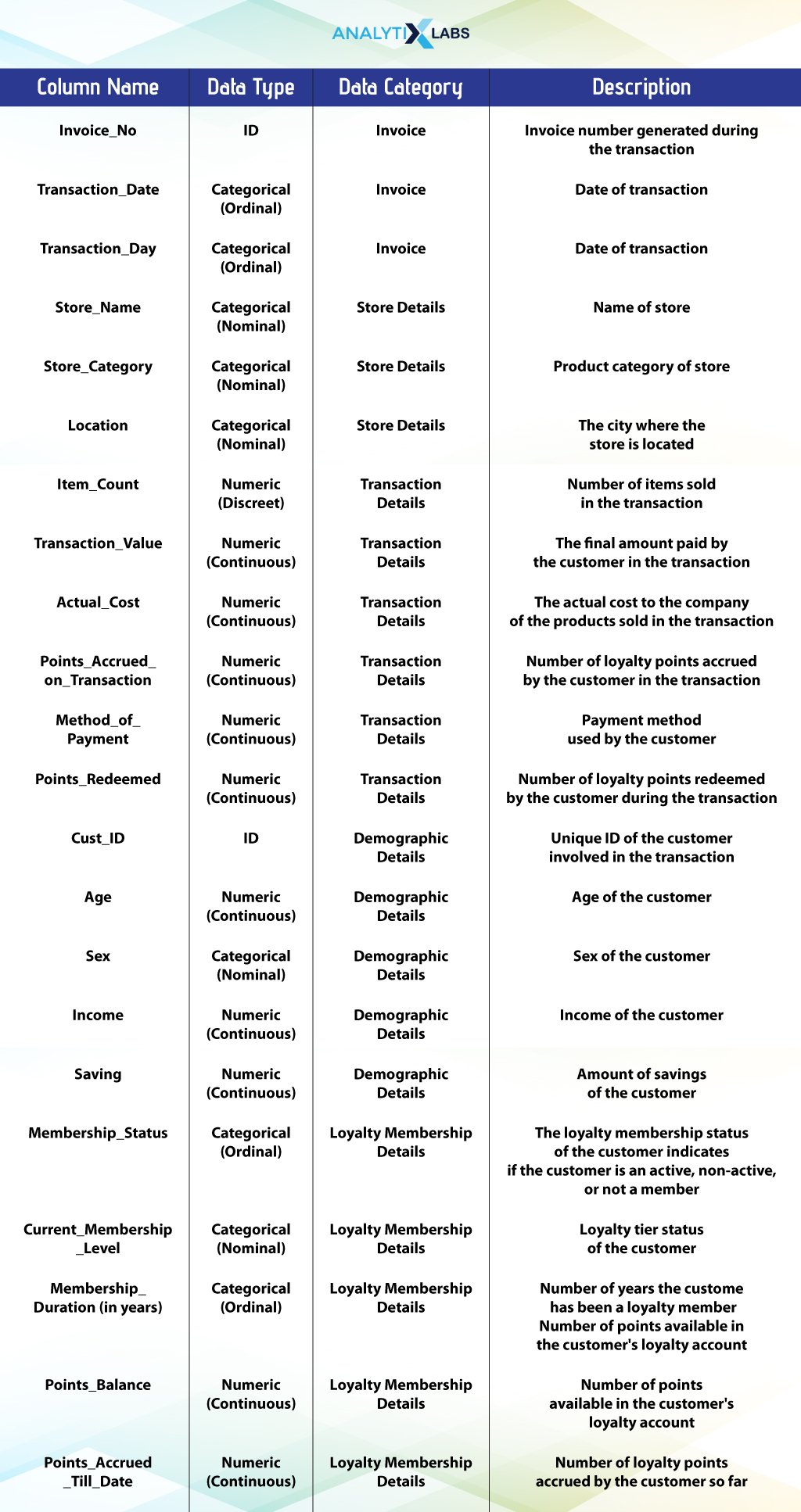
We are using transaction data, with a week of transactions from Monday, 2nd October 2023, to Sunday, 8th October 2023. Each row indicates a transaction in any store owned and managed by a retail giant. The data has transaction time details, store details, transaction details, demographic details of the individual involved in the transactions, and loyalty membership details.
Read the table below to understand the data you are working with.
-
Basic EDA
The aim of visualizing this data is to perform medium to advanced exploratory data analysis (EDA). But before doing that, we will perform basic EDA using Pandas to give you more idea of the data you are dealing with.
# importing key libraries
#import pandas as pd

import numpy as np

import matplotlib

from matplotlib import pyplot as plt

from matplotlib_venn import venn2, venn2_circles

import seaborn as sns

from pywaffle import Waffle

import squarify

import plotly.express as px

import waterfall_chart
# import data
df = pd.read_excel ("transaction_data.xlsx")
# printing the top 10 rows of the data
display(df.head(10))
# finding the data types of variables
df.dtypes
# finding number of rows and columns
print('Number of rows: ', df.shape[0])
print('Number of columns: ', df.shape[1])
# basic summary statistics
df.describe()
Let’s now start with visualizing this data in Python.
Basic Visualization in Python
I will explore those graphs as part of basic visualization, primarily univariate plots. While they can be made into bivariate or even multivariate, they are essentially univariate. These graphs would be histograms, boxplots, line charts, and KDE plots.
-
Histogram
A histogram allows you to visualize data in a grouped format. It is typically used to represent the data distribution and assess whether it is continuous or discreet. It can be considered a bar chart displaying the count of values falling in different ranges (bins). The x-axis is the bins, while the y-axis has the frequency or count.
i. Simple Histogram
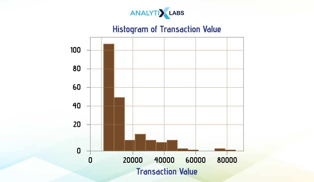
In a simple histogram, one variable is used to visualize its distribution. We consider the ‘Transaction_Value’ column of the ‘weekly_transaction’ dataset and create a histogram using the three main Python visualization libraries, i.e., Pandas, Matplotlib, and Seaborn.
- Pandas
We can create a histogram using the ‘plot’ attribute for a Pandas Series. Here, we will use the variable we want to create a histogram for using the keyword ‘hist’ in the argument ‘kind’.
We have added a few more details, such as the color and edge color of bars in the histogram, and also specified the number of bins. This is a pattern you will see whenever you want to create a Pandas plot where some attribute of the Pandas Series or Pandas DataFrame will allow you to quickly create a certain kind of chart.
As mentioned, we use Matlotlib’s Pylot to show the graph and make it aesthetically more appealing by adding titles and labels on the x and y axes.
# creating histogram
df.Transaction_Value.plot(kind = 'hist', color = "red", edgecolor = "black", bins = 12)
# adding aesthetics
plt.title("Histogram of Transaction Value") # adding chart title
plt.xlabel("Transaction Value") # adding labels on the x axis
plt.ylabel("Count") # adding label to the y axis
plt.grid(True) # adding grid lines
# showing the plot
plt.show()
- Matplotlib
Matplotlib is not only there to make the graphs more aesthetic but has serious capability to create great detailed graphs with ease. Below, we will create the same histogram using Matplotlib’s Pyplot.
Pyplot, unlike Pandas visualization, offers greater flexibility by accepting various data formats like Pandas Series, DataFrame, arrays, lists, dictionaries, etc. This flexibility allows for more diverse graph creation options compared to Pandas. However, creating plots with Pyplot can sometimes be challenging.
In Pyplot, you provide the Pandas Series as input for the x-axis data, with other arguments remaining similar. While some argument names differ between Pandas and Pyplot, shared ones simplify visualization coding.
We have used the code mentioned above; we are just changing the line where we created the histogram using Pandas.
# creating histogram
plt.hist(x = df['Transaction_Value'], color = "red", edgecolor = "black", bins = 12)

- Seaborn
Now, we will use Seaborn to create the same histogram we created using Pandas and Matplotlib. Given how identical the histograms from these three libraries are, you might think they are similar in capabilities, too.
However, nothing can be far from the truth. Seaborn is generally much more capable and is especially easy when dealing with data available to you in dataframes. This is also evident from its syntax structure, where, unlike Maplotlib, it doesn’t take in an array, list, or Pandas Series as input but rather requires providing the name of the dataframe. Here, the user needs to explicitly mention the name of the columns based on which the graphs need to be created.
Here, too, we switch the one line creating the histogram and create one using Seaborne rather than Matplotlib.
# creating histogram
sns.histplot(x='Transaction_Value', data=df, color = 'red')
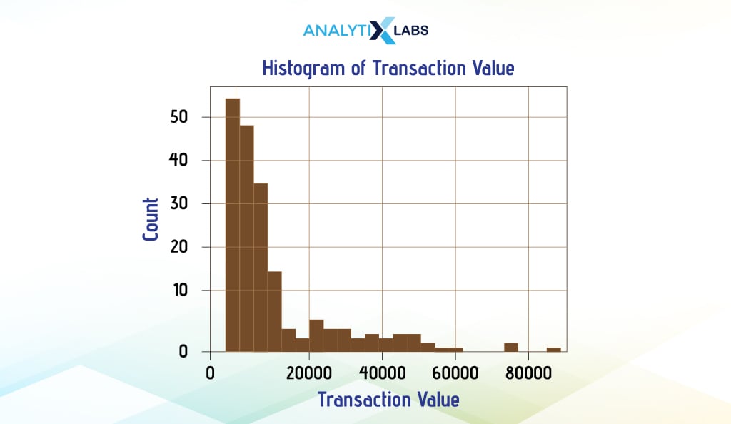
Remember that we will follow this approach of switching the lines, constructing the graph, and showing you the edited code when comparing similar graphs created from different libraries. This way, you can easily compare how different libraries create the same graph without needing to read a complete block of code repeatedly.
ii. Bivariate Histogram
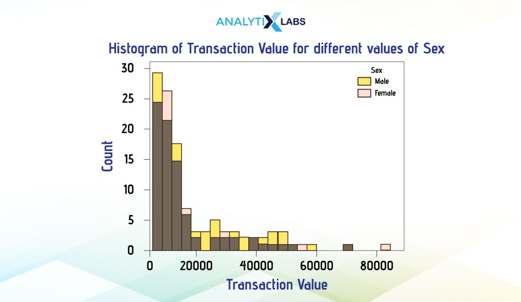
It is possible to create a bivariate histogram too. Here, two superimpose histograms are created. To do so, we will use Seaborn, where we’ll create a histogram for the column ‘Transaction_Value’, but this time, we’ll also add the column ‘Sex’. This way, the histogram shows the distribution of the transaction value where the ‘Sex’ is ‘Male’ and the distribution where ‘Sex’ is ‘Female’.
To achieve this, we created the histogram using Seaborn, but this time, we’ve added the column ‘Sex’ to the argument ‘hue’. This creates two histograms with different colors. As we advance, you will notice how this argument can often be used to expand the capability of a univariate or bivariate graph to include more variables.
# creating histogram
sns.histplot(x='Transaction_Value', data=df, kde=True, hue='Sex')
# adding aesthetics
plt.title("Histogram of Transaction Value for different values of Sex")
plt.xlabel("Transaction Value")
plt.ylabel("Count")
# showing graph
plt.show()
-
Boxplot
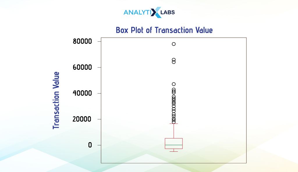
Boxplot is another way of visualizing the distribution of continuous data. It provides crucial information about the data, such as its mean, variance, and outliers. They can be used to assess the spread of the data and find the level of skewness in the data.
Boxplots can be easily created using all the three Python libraries in discussion. If you compare the code with the one used to create histograms, you will quickly understand how the syntax of these libraries is designed.
More or less, you will be changing the attribute name boxplot along with a few associated arguments to construct. However, the way you provide the data will be similar to before.
Pandas
We create a boxplot using pandas by using the attribute ‘plot’ available for Pandas DataFrame and setting the argument ‘kind’ to ‘box’.
# creating boxplot
df['Transaction_Value'].plot(kind = 'box')
# adding aesthetics
plt.title("Box Plot of Transaction Value")
plt.ylabel("Transaction Value")
ax = plt.gca(); ax.axes.xaxis.set_ticklabels([]) # removing xtick value
# showing plot
plt.show()
Matplotlib
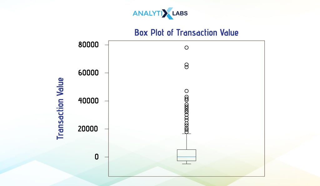
To create a boxplot in Matplotlib, we use the attribute ‘boxplot’ available for Pyplot.
# creating boxplot
plt.boxplot(x = df['Transaction_Value'])
Seaborn
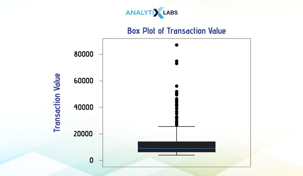
We use the attribute ‘boxplot’ of Seaborn to create a boxplot.
# creating boxplot
sns.boxplot(y = 'Transaction_Value', data = df)
-
Line Chart
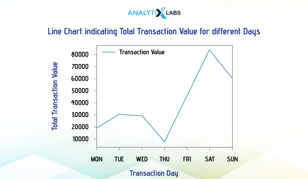
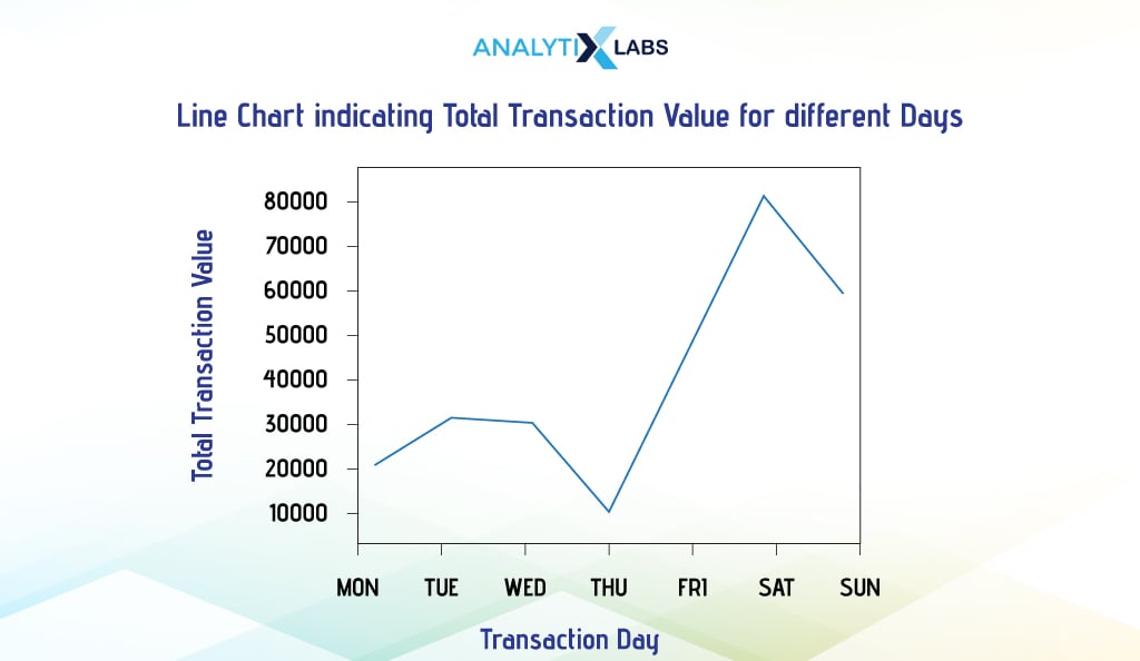
A line chart (aka line graph) displays trends in data by typically showing the relationship of numerical data shared with time. A series of individual data points are connected to form a line chart with the time component (or sometimes categories) on the x-axis and the data point’s value on the y-axis.
i. Single Line Chart
Single-line charts indicate the trend of one numerical column over time or sometimes categories. It is extremely simple to create in Python. Below, we aggregate data to get the total transaction value for the different days of the transaction period.
# aggregating data by calculating the total transaction value for different dates
df_agg = df.groupby(by = ['Transaction_Date'])['Transaction_Value'].sum().reset_index()
df_agg
We will now use this aggregated data to create the line chart.
- Pandas
In this example, we must first set the transaction dates as an index to create a line chart using Pandas.
# setting the column with the dates as index
df_agg_index = df_agg.set_index('Transaction_Date')
df_agg_index
We can now easily create a line chart.
# creating line chart
df_agg_index.plot()
Before outputting the graph, we made some aesthetic changes, such as adding a title and changing the x-tick values to the day name.
# adding aesthetics
plt.title("Line Chart indicating Total Transaction Value for different Days")
plt.xlabel('Transaction Day')
plt.ylabel('Total Transaction Value')
# setting the values on the x-axis
plt.xticks(ticks = df_agg_index.index , labels = ['Mon', 'Tue', 'Wed', 'Thu', 'Fri', 'Sat', 'Sun'])
# showing plot
plt.show()
- Matplotlib
To do the same in Matplotlib, we used the above-aggregated data indexed by dates and used the ‘plot’ attribute of Pyplot.
# creating line chart
plt.plot(df_agg_index['Transaction_Value'])
- Seaborn
Once again, Using Seaborn is much simpler. We created the plot by aggregating the data using the Transaction Date and Day.
# aggregating data by calculating the total transaction value for different dates and days
df_agg = df.groupby(by = ['Transaction_Date', 'Transaction_Day'])['Transaction_Value'].sum().reset_index()
df_agg
Now, while ‘Transaction_Date’ sorts the data, we use ‘Transaction_Day’ on the x-axis and ‘Transaction_Value’ on the y-axis.
# creating line plot
sns.lineplot(x = 'Transaction_Day', y = 'Transaction_Value', data=df_agg)
# adding aesthetics
plt.title("Line Chart indicating Total Transaction Value for different Days")
plt.xlabel('Transaction Day')
plt.ylabel('Total Transaction Value'))
# showing plot
plt.show()

ii. Multiline Chart
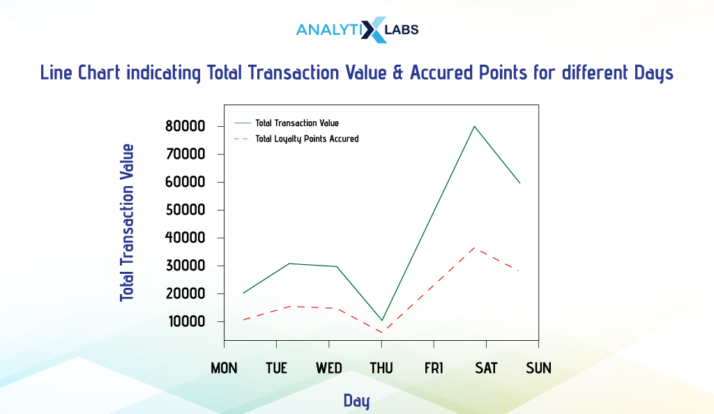
As the name suggests, multiline charts have more than one line in the plot. Below, we will create a multiline chart to plot the total transaction value and loyalty points members accrued on different days of the week. We use Matplotlib, as creating multiline charts is much easier than others.
Below, we aggregate data by calculating the sum of transaction value and redeemed loyalty points on different dates and indexing this data by transaction day.
# aggregating data by calculating the total transaction value and points accrued
df_agg = df.groupby(by ['Transaction_Date','Transaction_Day']).agg({'Transaction_Value':'sum', 'Points_Accrued_on_Transaction':'sum'}).reset_index()
# setting the column with the days as index
df_agg_index = df_agg.set_index('Transaction_Day')
df_agg_index
We then create two line charts using pyplot and provide each one with different colors and line markings to differentiate them.
# creating line plots
plt.plot(df_agg_index['Transaction_Value'], c = 'green', label ='Total Transaction Value')
plt.plot(df_agg_index['Points_Accrued_on_Transaction'], '-.', c = 'red', label = 'Total Loyalty Points Accrued')
We also use the following function to display the legend in the graph.
plt.legend()
-
KDE Plot
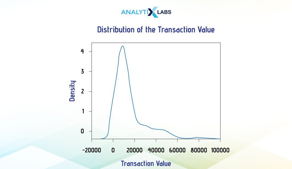
The Kernel Density Estimation (KDE) plot is the best way to visualize continuous data. It visualizes the data’s probability density using a smooth continuous curve. Assessing the shape of the data through the curve helps users understand the distribution type they are dealing with.
Seaborn can quickly help you create KDE plots. Below, we will create the KDE plot for the column ‘Transaction_Value’ using Seaborn’s function kdeplot().
# creating KDE plot
sns.kdeplot(df['Transaction_Value'])
After the basics, let’s focus on more complicated graphs in the next section.
Intermediate Visualization in Python
For intermediate-level visualization, we will focus on commonly used comparison charts and discuss how to create univariate, bivariate, and multivariate versions of them. The graphs in focus here will be scatterplot, pie chart, area chart, and bar chart.
-
Scatterplot
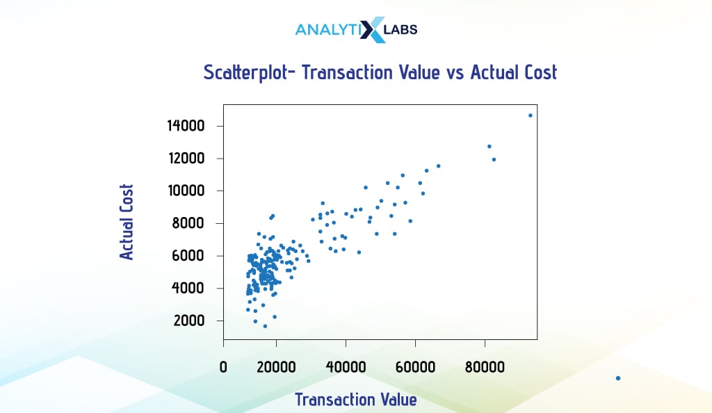
Scatterplots help visualize the relationship between two numerical variables. Here, both the x and y axes have numeric values, allowing users to understand correlation, trend, linearity of relationship, and anomalous values.
However, scatterplots can be created using one categorical variable, too, with the categories being on the x-axis, which helps understand how the data is distributed for different categories.
i. Bivariate Scatterplot
As the name suggests, a bivariate scatterplot involves two variables. These two variables can be numeric, which is normally the case, but they can be situations where one is numeric, and the other is categorical. We will explore both of these situations below.
Suppose you want to understand the relationship between the transaction value and the cost of the items sold. To do so, you can create a scatterplot with one column on each axis.
Pandas
To create a scatterplot, use the ‘plot’ attribute of the pandas DataFrame and provide the two column names for the ‘x’ and ‘y’ arguments.
# creating scatterplot
df.plot.scatter(x = 'Transaction_Value', y = 'Actual_Cost')
Matplotlib
In Matplotlib, you use the scatter() function of Pyplot and provide two vectors (in our case, Pandas Series) for the ‘x’ and ‘y’ arguments to create a bivariate scatterplot.
# creating scatterplot
plt.scatter(x = df['Transaction_Value'], y = df['Actual_Cost'])

Seaborn
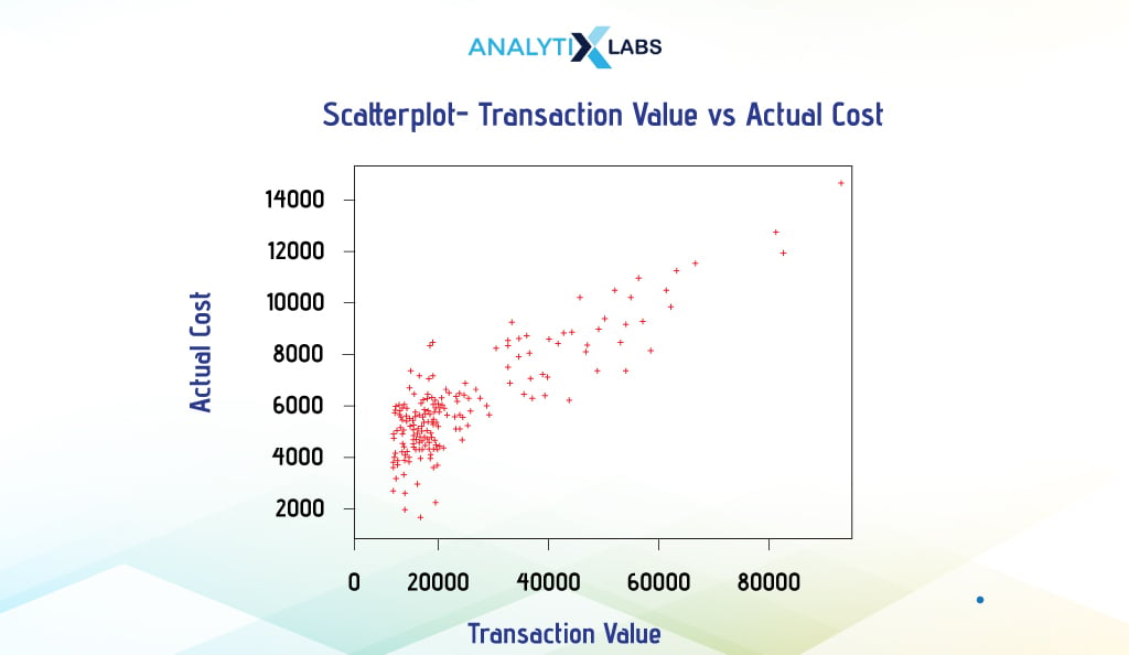
You provide the dataframe and then mention the name of the variables for the ‘x’ and ‘y’ axis arguments to create a scatterplot in Seaborn. Below, we use a few more arguments, such as ‘s’, ‘c’, and ‘marker,’ to change the size, color, and shape of the data points in the scatterplot.
# creating scatterplot
sns.scatterplot(data=df, x = "Transaction_Value" , y = "Actual_Cost", s = 100, c = 'red', marker = "P")
ii. Multivariate Scatterplot
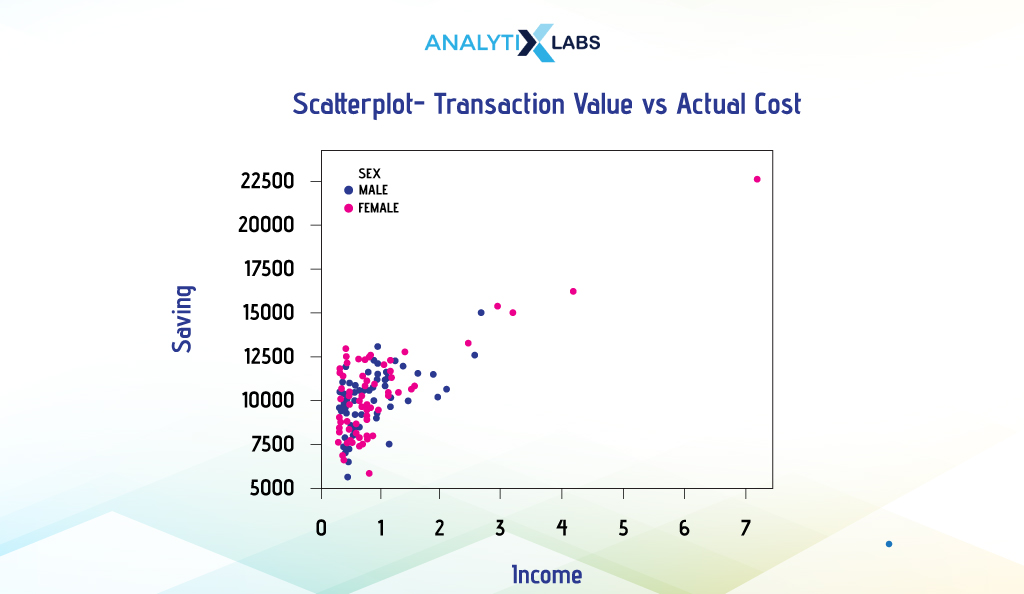
We mentioned a scatterplot involving numerical and categorical columns to help us understand the purpose of a multivariate scatterplot. In a multivariate scatterplot, one or more columns are introduced to provide more information about the relationship between the variables.
Suppose you want to create a scatterplot to understand the relationship between a customer’s income, savings, and sex. We will use Seaborn to provide the two numerical columns ‘Income’ and ‘Saving’ in the x and y-axis arguments, respectively, and use the column ‘Sex’ for the data point color argument. We will assign red and blue colors to the different categories of sex.
# creating scatterplot
sns.scatterplot(data = df, x = "Income", y = "Saving", hue = "Sex", palette = ['blue','red'])
-
Pie Chart
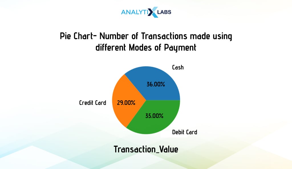
A pie chart can visualize the distribution or proportion of different categories of a categorical dataset. It has a circular visualization like a pie, with each portion or pie slice indicating a certain percentage or proportion of the complete data. Often, different colors are used to restrict different slices.
Creating a Pie Chart using Pandas is extremely simple. In this example, we first calculate the count of transactions made using different payment methods.
# aggregating data by calculating the frequency of the different methods of payment
df_agg = df.groupby(['Method_of_Payment']).size()
df_agg
We now visualize this data using a pie chart using Pandas’ plot’ attribute. We used the ‘auto_pct’ argument to indicate the proportion of each payment method in the pie.
# creating boxplot
df_agg.plot(kind = "pie", subplots = True, legend = False, autopct = "%.2f%%")
# adding aesthetics
plt.title("Pie Chart - Proportion of Transactions made using different Modes of Payment")
plt.xlabel('Transaction_Value')
plt.ylabel("")
# showing plot
plt.show()
-
Area Chart
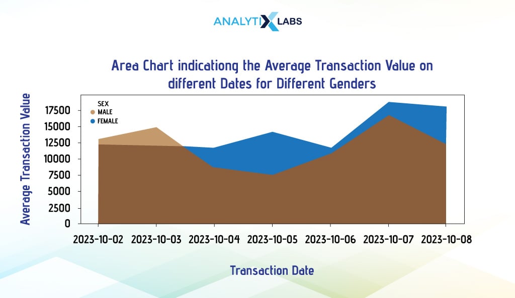
An area graph or plot helps visualize data over time (and sometimes categories) with the values on the y-axis and the time component on the x-axis. It is commonly used to track changes between two groups over time.
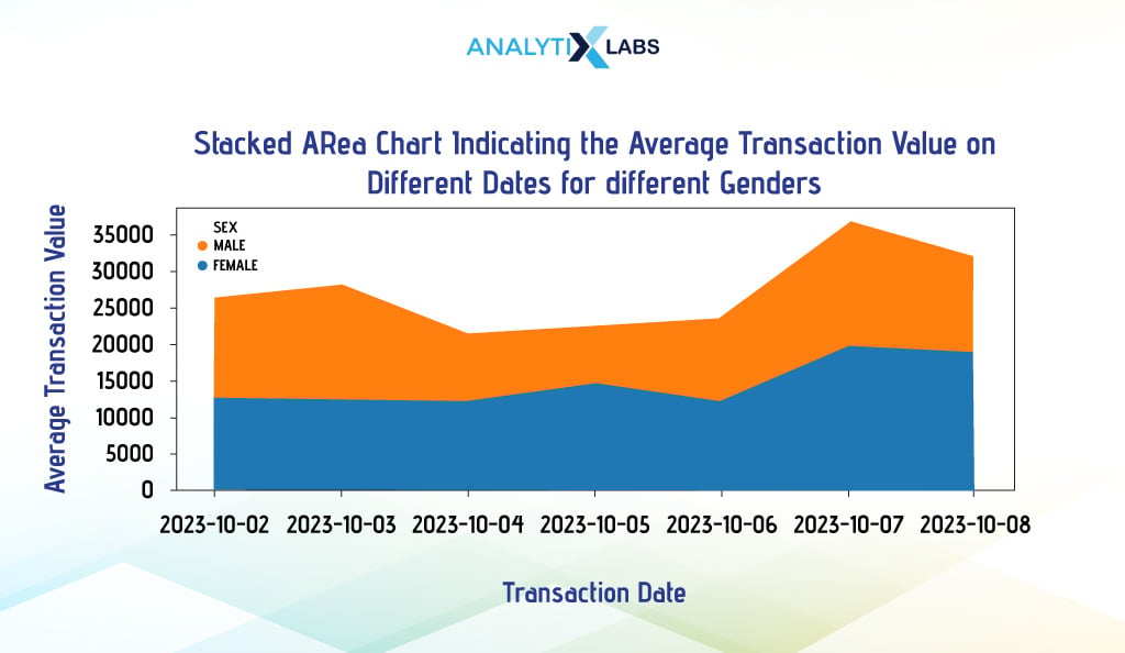
Multiple data series can overlap, creating overlapping area charts, or can be placed on top of each other, creating a Stacked Area chart. While overlapping area charts help compare data series relationships, a stacked area chart, on the other hand, allows for cumulative comparison.
i. Overlapping Area Chart
Pandas are the best option for creating overlapping area charts. Below, we will create an area chart that indicates the average transaction value on different dates or days for different gender values.
To do so, we first aggregate the data using pivot_table() so that it is in the wide format, as this is how the Pandas plot function requires the data to be. We then change the data type of the ‘Transaction_Data’ column from Date to String and use it to index data. Once done, we use Pandas plot and set the argument ‘kind’ to ‘area’ to create an area chart.
# aggregating data by calculating average transaction value for members of different sex and location
df_agg = pd.pivot_table(df, values = "Transaction_Value", index = "Transaction_Date", columns = "Sex", aggfunc = np.mean).reset_index()
# converting date to string
df_agg['Transaction_Date'] = df_agg['Transaction_Date'].astype('str')
# setting the day column as index
df_agg.index = df_agg['Transaction_Date']
# creating area chart
df_agg.plot(kind='area', stacked=False, figsize=(15, 5)
ii. Stacked Area Chart
As the name suggests, a stacked area chart will have the data series stacked on each other. You can use either Pandas or Matplotlib to create such graphs easily. We will use the above-case scenario to create a stacked area chart.
Pandas
To create a stacked area chart, you must set the argument ‘stacked’ to ‘True’.
# creating stacked area chart
df_agg.plot(kind='area', stacked=True, figsize=(15, 5))
-
Bar Chart
A bar chart can compare metric values across different data segments. Here, the x-axis has the categorical variable’s classes with the values on the y-axis. The height of the rectangular bars corresponds to the value they represent.
i. Simple Bar Chart
The simple or traditional bar plots (bar plots) are where you have one numerical and one categorical column, and the relationship between them is established using some summary statistic. Below, we will create charts using different visualization libraries.
Pandas
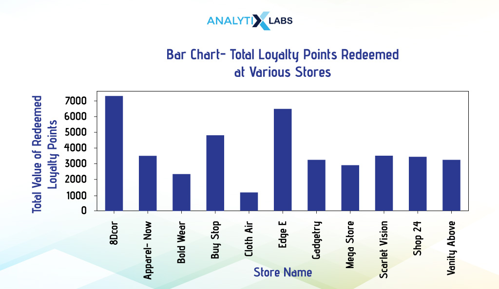
We visualize the total loyalty points redeemed at different stores. We first aggregate data and use the Pandas plot() function by setting the argument ‘kind’ to ‘bar’ to create a barplot.
# aggregating data by calculating the total transaction value
df_agg = df.groupby(by=['Store_Name'])['Points_Redeemed'].sum() # not resetting index
# creating bar chart
df_agg.plot(kind = "bar", figsize = (10,3))
Matplotlib
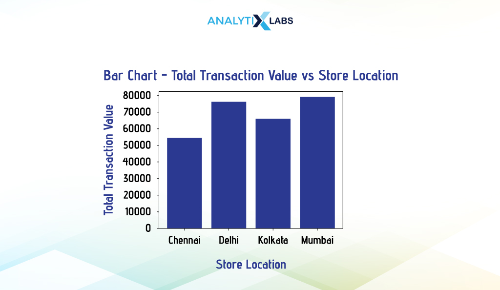
We use Pyplot’s bar() function to visualize the total transaction value of stores at different locations. Here, we aggregate the data and then set the ‘x’ argument to the categorical column and the ‘height’ argument to the numerical column with the summary statistics.
# aggregating data by calculating the total transaction value
df_agg = df.groupby(by=['Location'])['Transaction_Value'].sum().reset_index()
# creating bar chart
plt.bar(x = df_agg['Location'], height = df_agg['Transaction_Value'])
Seaborn
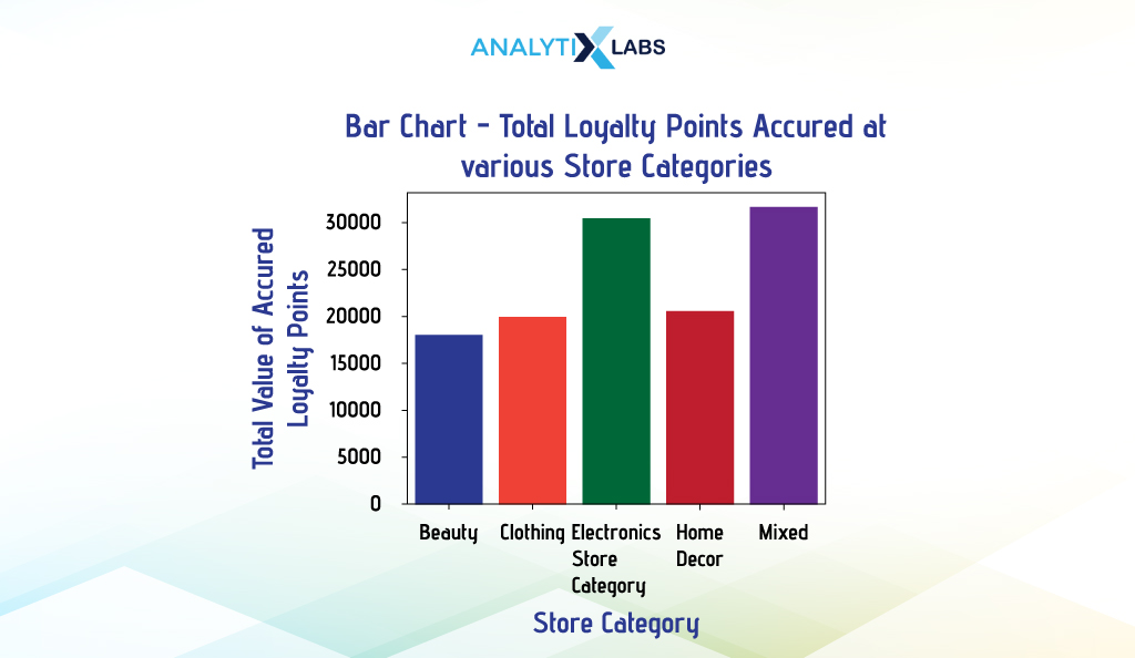
We created a bivariate bar chart indicating the total loyalty points accrued at different store types. After aggregating the data to get the desired information, we use Seaborn’s barplot() and provide the data and the categorical and numerical column names in the ‘x’ and ‘y’ arguments, respectively.
# aggregating data by calculating the total transaction value
df_agg = df.groupby(by=['Store_Category'])['Points_Accrued_on_Transaction'].sum().reset_index()
# creating bar chart
sns.barplot(data = df_agg, x = "Store_Category", y = "Points_Accrued_on_Transaction")
ii. Grouped Bar Chart
A grouped bar chart visualizes the relationship between multiple categories belonging to two or more variables. Thus, it is a form of multivariate bar chart. Here, you typically have one numerical column for summarizing the grouped categorical variables, which are typically two or sometimes more. The common types of grouped bar charts are dodged, stacked, and facet bar charts.
-
Dodged Bar Chart
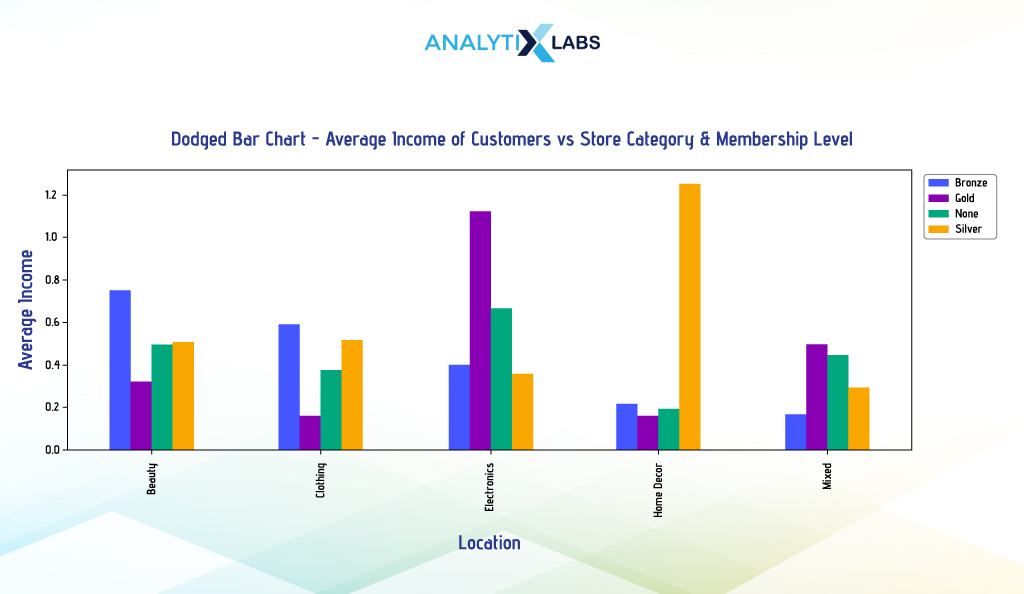
A dodged bar chart is a kind of grouped bar chart used for creating multivariate bar charts. Here, the multiple datasets are represented side by side. Typically, it involves two categorical and one numerical column, with the categorical columns on the x-axis and the numerical column on the y-axis. Each category on the x-axis is split into subcategories, which are distinguishable through different colors. Let’s understand this chart with a few examples.
Pandas
Suppose you create a multivariate bar chart indicating customers’ average income for different membership levels and store categories. This can be done by creating a dodged bar chart.
We use the pivot_table() function to aggregate data to get data in wide format, as this is how Pandas expects the data to be for creating a dodged bar chart (in wide format, each entity has a row of its own). We will ensure that we don’t reset the index as the levels in the data will be useful for Pandas to plot the data.
# aggregating data by calculating the average income of individuals for different membership level and store categories
df_agg = pd.pivot_table(df, values = "Income", index = "Store_Category", columns = "Current_Membership_Level", aggfunc = np.mean)
df_agg
Once we have this dataframe, we can use its plot() attribute and set the ‘kind’ argument to ‘bar’ to have a dodged bar chart.
# creating a dodged bar plot with custom transparency and figure size
df_agg.plot(kind = "bar", alpha = 0.9, figsize = (15, 5))
# setting the location of the legend so that it doesn't overlap the graph
plt.legend(bbox_to_anchor=(1.01, 1.0), loc='upper left')
Seaborn
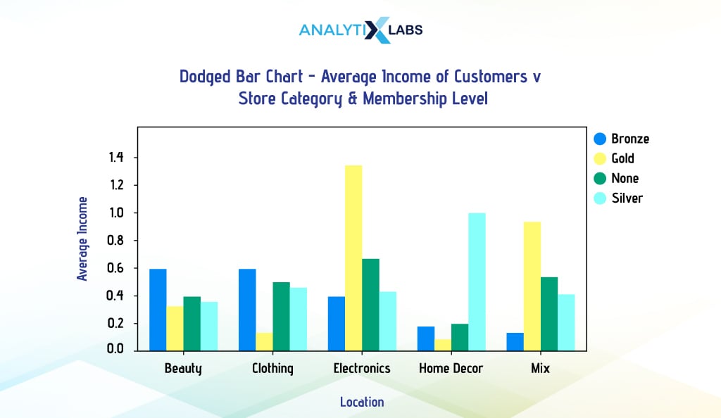
Creating a dodged bar chart in Seaborn is pretty straightforward. If we want to use Seaborn to create a dodged bar chart like the one above, we first need to aggregate the data.
However, we will use the groupby() function to get the output data in long format, as Seaborn requires the creation of a dodged bar chart (long data is where each entity can have multiple rows).
Also, we will have to ensure that we reset the index, as unlike Pandas, Seabron doesn’t need any levels to be there in the data.
# aggregating data by calculating the average income of individuals for different membership level and store categories
df_agg = df.groupby(['Store_Category', 'Current_Membership_Level'])['Income'].sum().reset_index()
df_agg
Once we have the aggregated data in long format, we can use Seaborn’s barplot() function and provide the names of the first and second categorical columns in ‘x’ and ‘hue’ arguments and the numerical column with summary statistics in the ‘y’ argument.
# setting up plot dimensions
fig, ax = plt.subplots(figsize = (10, 5))
# creating dodged bar plot
sns.barplot(x = 'Store_Category', y = 'Income', hue = 'Current_Membership_Level',
data = df_agg, ax = ax, palette = ['brown','gold','black','silver'])
# setting the location of the legend so that it doesn't overlap the graph
plt.legend(bbox_to_anchor=(1.01, 1.0), loc='upper left')
> Output:
We will not go further and won’t include Matplotlib in this discussion mainly because creating a dodged bar chart using it is unnecessarily complicated. Thus, it would be best to use Pandas or Seaborn to create a dodged bar chart.
-
Stacked Bar Chart
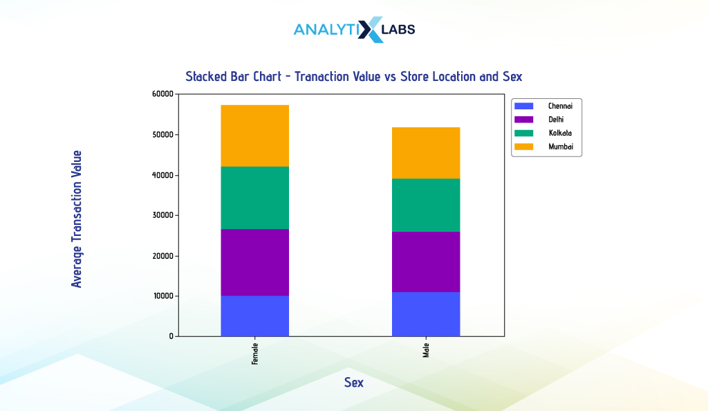
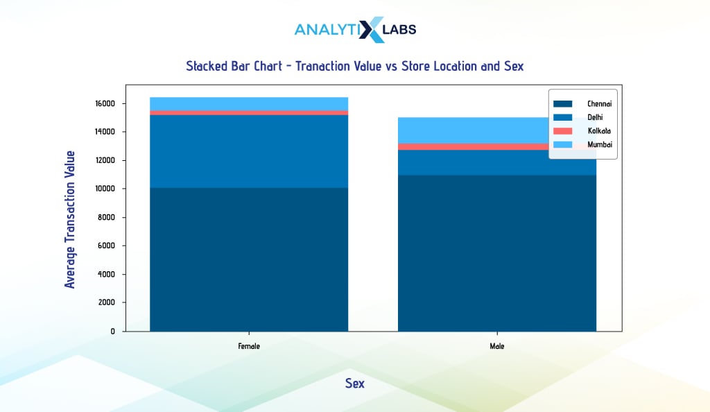
Unlike dodged bar charts, where bars are placed side by side, the bars are placed on top of each other in a stacked bar chart. Thus, they are used not for comparing different categories but for understanding category composition and part-to-whole relationships.
For example, you want to create a multivariate bar chart indicating the average transaction value of individuals from different cities and genders. To do so, we will create a stacked bar chart using Pandas.
First, we will aggregate the data using pivot_table() so that the output is in wide format. However, we will reset the index this time as we don’t intend to use the levels and will manually provide the values for the ‘y’ argument. This will ensure that the legend becomes visible.
# aggregating data by calculating the average value of transactions for different locations and sex
df_agg = pd.pivot_table(df, values="Transaction_Value",index="Sex", columns="Location", aggfunc=np.mean).reset_index()
df_agg
# resetting index name
df_agg.columns.name = None
df_agg
Upon having the data, we will use the attribute plot.bar()’ of it. We will create a stacked barplot by setting the categorical column ‘Sex’ to the ‘x’ argument and providing the numerical column names to the ‘y’ argument. We will also set the argument ‘stacked’ to ‘True’ to create a stacked bar chart.
# creating stacked bar plot
df_agg.plot.bar(x = 'Sex', y = ['Chennai','Delhi','Kolkata','Mumbai'], stacked = True, width = 0.4)
# setting the location of the legend so that it doesn't overlap the graph
plt.legend(bbox_to_anchor=(1.01, 1.0), loc='upper left')
If you wish to create a stacked barplot using Seaborn, then unfortunately, Seaborn’s barplot() function doesn’t have a parameter to draw stacked bars. You can create a stacked bar chart by creating individual plots and placing the bar charts on top of each other; however, this can be extremely time-consuming.
On the other hand, if you use the logic that has been used so far to create a dodged barplot in Seaborn and use the ‘hue’ argument to accommodate the second categorical column, the results will not be promising, as the bars will be created in front of each other, as seen below.
# aggregating data by calculating the average income of individuals for different membership level and store categories
df_agg = df.groupby(['Location', 'Sex'])['Transaction_Value'].mean().reset_index()
# setting up dimensions
fig, ax = plt.subplots(figsize = (10, 5))
# creating stacked bar plot
sns.barplot(x = 'Sex', y = 'Transaction_Value', hue = 'Location', data = df_agg, ax = ax, dodge = False, alpha = 0.4)
As using Matplotlib is a bit complicated, the only library you can easily use to create a Dodge barplot is Pandas.
Finally, we will explore a few advanced visualization plots in the section below.
Advanced Visualization in Python
Advanced visualization in Python often requires you to use specialized libraries other than the usual Pandas, Matplotlib, or Seaborn. These also include those graphs that need advanced technical skills or domain knowledge to create or interpret such graphs. Following are a few of the most interesting graphs that can help you better understand the data you are dealing with.
-
Heat Map
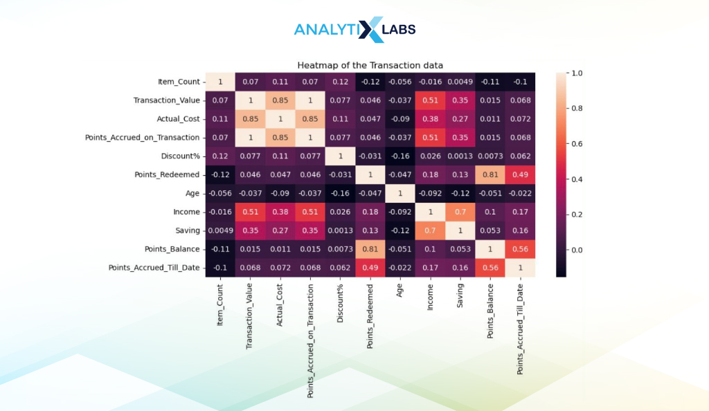
A heatmap can easily visualize a two-dimensional table or matrix. The values in a heatmap are represented on a grid using a color scale, with each square having a color associated with the magnitude of the value.
For example, an intense dark color may represent a low value, and a light value represents a large number. Heatmaps in Python are popularly used to visualize correlation matrices so that relationships and patterns in the data can be easily identified.
You first need to create a correlation matrix to create a heat map. We will use all the transaction data’s numerical columns and the corr() function.
# extracting all the numerical columns (except id variable) and creating a correlation table
corr_df = df.select_dtypes(include='number').drop('Invoice_No', axis = 1).corr()
corr_df
We used Seaborn to create the heatmap, providing the data with the correlation matrix to the heatmap() function and set ‘and not’ to true so that the correlation values are visible.
# setting figure size
plt.figure(figsize=(10,5))
# creating a heatmap
sns.heatmap(corr_df, annot=True)
-
Bubble Chart
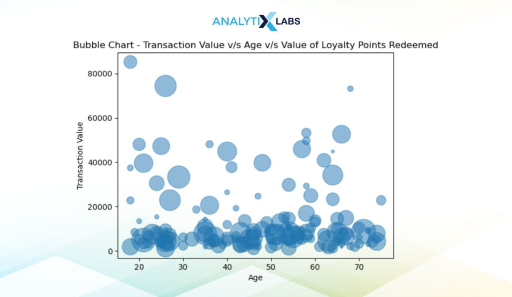
The bubble chart extends the concept of a scatterplot. Here, a third, often numerical column is introduced through the size and hue of the data points, with larger values indicating higher values and vice-versa. As the bubbles (data points) are translucent, a dark region indicates the concentration of data.
We first create a bubble chart using Matplotlib. Suppose you want to understand the relationship between transaction Value, age, and the redeemed loyalty points. To visualize this relationship using a bubble chart, you can use the scatter() function of Pyplot and use the size argument ‘s’ to accommodate the third variable. To make data points appear like bubbles, we set the argument ‘alpha’ value to 0.5 so that the points are translucent.
# creating bubble chart
plt.scatter('Age', 'Transaction_Value', s = 'Points_Redeemed', alpha = 0.5, data = df)
-
Marginal Plot
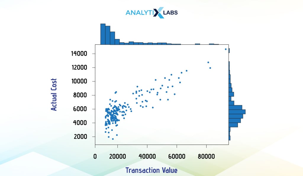
Marginal Plots allow you to examine the relationship between two variables while simultaneously understanding their distributions. Such plots typically have boxplots, histograms, or dot plots in the margin of the respective axis to convey the distribution. We create a marginal plot using Seaborn’s joint plot (), which creates histograms in the margin and a scatterplot in the middle.
# creating marginal plot
sns.jointplot(x = df["Transaction_Value"], y = df["Actual_Cost"], kind='scatter')
-
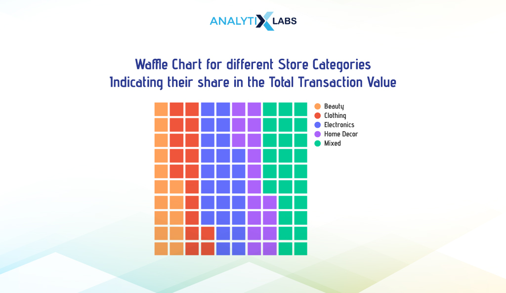
Waffle Chart
Waffle Chart allows users to visualize data in a grid format comprised of small, equally sized squares, similar to how a waffle appears. Each square represents a particular data unit, helping to visually represent the proportion of a segment relative to the total data.
This is achieved by coloring the squares of different segments differently. While such a way of visualizing data is more appealing, the chart may become complicated if there are too many segments.
i. Traditional Waffle Chart
Suppose you want to visualize the total transaction value of different store categories. To do so, you first need to aggregate the data.
# aggregating data by calculating the total transaction value
df_agg = df.groupby(by=['Store_Category'])['Transaction_Value'].sum().reset_index()
# rounding off the transaction values
df_agg['Transaction_Value'] = round(df_agg['Transaction_Value'],0).astype('int')
df_agg
We then convert this data into a dictionary to reduce the visualization processing time.
# converting the aggregated data into a dictionary
df_agg_dict = df_agg.set_index('Store_Category')['Transaction_Value'].to_dict()
We now use Pyplot’s figure() function, where we set the argument ‘FigureClass’ to ‘Waffle’ to create a waffle chart. We create a 10×10 grid by mentioning 10 in the ‘nrows’ and ‘cols’ arguments and then provide the dictionary to the ‘values’ argument.
# setting colors
mycolors = ['#FFA15A','#EF553B','#636EFA','#AB63FA','#00CC96']
# creating waffle chart
plt.figure(FigureClass = Waffle, rows = 10, columns = 10, values = df_agg_dict,
colors = mycolors,
legend = {'loc': 'upper left', 'bbox_to_anchor': (1, 1)})
ii. Custom Icon Waffle Chart
Add different icons for different categories to make the waffle chart more intuitive. We set the ‘icon_legend’ to ‘True’ and provide different icon names in the ‘icons’ argument.
# setting colors
mycolors = ['#FFA15A','#EF553B','#636EFA','#AB63FA','#00CC96']
# setting icons
myicons = ['wand-magic-sparkles', 'shirt', 'laptop', 'couch', 'cart-shopping']
# creating waffle chart
plt.figure(FigureClass = Waffle, rows = 10, columns = 10, values = df_agg_dict,
colors = mycolors, icons = myicons, icon_legend = True,
legend = { 'loc': 'upper left', 'bbox_to_anchor': (1, 1)}
-
Venn Diagram
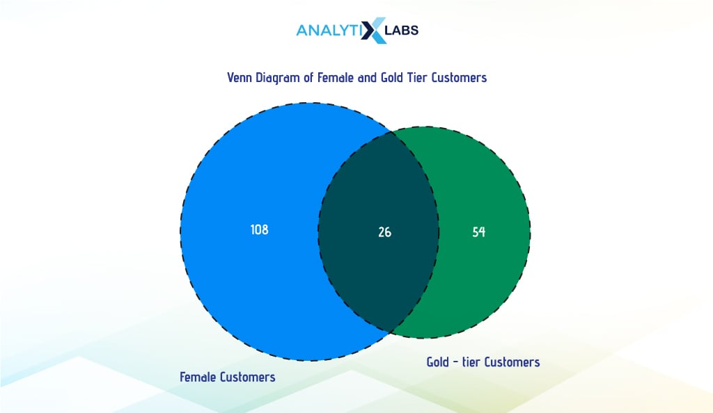
A Venn diagram can illustrate the relationship between groups of elements. It has two or more overlapping circles indicating the commonalities and differences between various groups. While overlapping areas indicate elements common to the corresponding sets, non-overlapping areas represent elements unique to the particular set. Let us understand this with an example.
Suppose we want to create a Venn diagram indicating that female customers are gold-tier members or both. To get the values, we create a cross tab between the columns’ Sex’ and ‘Current_Membership_Level’.
# creating a cross tab to calculate some values for the venn diagram
ct_df = pd.crosstab(df['Sex'], [df['Current_Membership_Level']])
ct_df = ct_df.reset_index(level = 0)
ct_df.columns.name = None
# viewing the cross-tab
ct_df
We then use the cross tab to calculate the total number of women customers, total gold tier customers, and customers who are female and gold tier members.
# calculating the total number of women customers
count_females = ct_df.loc[ct_df['Sex']=='Female', ['None','Bronze','Silver','Gold']].sum().sum()
# calculating the total number of customer with gold tier loyalty status
count_gold = ct_df.loc[:, 'Gold'].sum()
# calculating the total number of female customer with gold tier loyalty status
count_females_gold = ct_df.loc[ct_df['Sex']=='Female', 'Gold'][0]
# printing the information required for creating the Venn diagram
print("Number of Female customers : ", count_females)
print("Number of Gold Tier customers : ", count_gold)
print("Number of customer who are both Female and Gold Tier :", count_females_gold)
We now use the library ‘matplotlib_venn’ to create the Venn diagram. Here, we use its venn2() function to create a Venn diagram with two intersecting circles by providing the values for the area of the left, tight, and inner circles. Additionally, we use the venn2_circle() function to create the outline of the circles.
# creating the Venn diagram
venn2(subsets=(count_females, count_gold, count_females_gold),
set_labels=('Female Customers', 'Gold-tier Customers'),
set_colors=("red", "yellow"), alpha=0.7)
# adding the outline to the diagram
venn2_circles(subsets=(count_females, count_gold, count_females_gold),
linestyle="dashed",
linewidth=2)
> Output:
-
Tree Map
A tree map is used to understand the contribution made by different segments. It allows for the grouping and nesting of data and visualization of it in a hierarchical structure. In a simple single-level, non-hierarchical tree map, various rectangles represent the different categories of the data, with the size of the rectangle indicating the magnitude of the underlying data.
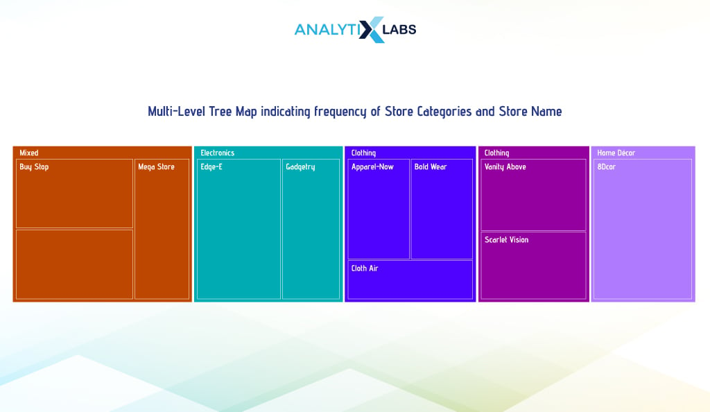
In multilevel hierarchical tree maps, categories are arranged in a parent-child relationship, with subcategories grouped under their parent category, resulting in an overall chart with a tree structure.
i. Single Level
A single-level tree map will use one variable’s categories. We use the ‘Store_Category’ variable, where we first count the frequency of its various categories.
# aggregating data by counting the number of stores in the transaction data
agg_df = df.groupby(by=['Store_Category'])[['Store_Category']].count().add_prefix('Count_of_').reset_index()
agg_df
We then use the ‘squartify’ library to create a tree map. The size of the cubes is managed by the ‘sizes’ argument, where we provide the ‘Count_of_Store_Category’ column, and the labels and colors are taken care of by the ‘label’ and ‘color’ arguments, respectively.
# setting up colors
colors=['#FFA15A', '#EF553B', '#AB63FA', '#636EFA', '#00CC96']
# setting seaborn plot style
sns.set_style(style="whitegrid")
# creating tree map
squarify.plot(sizes = agg_df["Count_of_Store_Category"], label = agg_df["Store_Category"],
alpha = 0.99, color=colors).set(title='Tree Map for Store Categories Count')
# removing the axis values
plt.axis('off')
# showing plot
plt.show()
ii. Multilevel
If you want more granularity, you can use a multilevel tree map. Here, we create a two-level tree map showing each store’s share in transactions under different store categories.
To do this, we will use a module of the library Plotly known as express. Below, we aggregate data by grouping store categories and names and summarizing them by calculating their count. We then used the express module to create the multilevel tree map.
Here, we first set the hierarchy of levels using the argument ‘path’. To set the sizes of the sections is taken care of by the ‘values’ argument, where they provide the count values.
# aggregating data by calculating the number of transactions of every store
df_agg = df.groupby(['Store_Category', 'Store_Name']).size().reset_index(name='Count')
# creating Tree Map
fig = px.treemap(df_agg, path=['Store_Category','Store_Name'], values='Count', color='Store_Category',

color_discrete_map={ 'Beauty' : '#FFA15A', 'Clothing' : '#EF553B', 'Home Décor' : '#636EFA',

'Electronics' : '#AB63FA', 'Mixed' : '#00CC96'})
# adding title
fig.update_layout(title=dict(text = "Multi-Level Tree Map indicating frequency of Store Categories and Store Name",
x = 0.5, y = 1, font=dict(size=18), yref='paper'))
-
Waterfall Chart
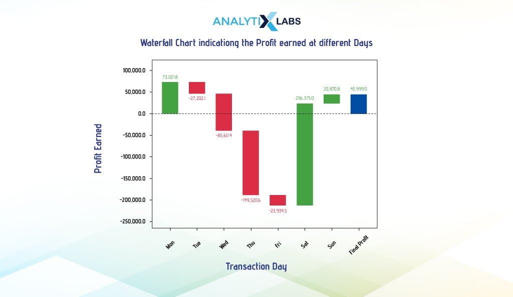
A waterfall chart (aka a bridge or cascade chart)helps visualize sequential positive and negative values and their overall effect. It also helps understand how the values of a variable change (whether they are subject to increment or decrement) over time or stages.
It is particularly useful to understand financial records like budget, income, revenue, etc. Typically, a sequence of bars is used with a green bar indicating an increase in magnitude compared to the preceding value and red indicating vice-versa. For coloring the first bar, the baseline value is used to assess whether it is red or green.
To create a waterfall chart, we start by manipulating the data. We calculate the profit by subtracting the actual cost from the transaction value. Then, we group data by transaction date and day, summing up profits to get daily profit. Net profit is derived by subtracting daily operating cost from daily profit. This data, showing profit and loss on different days, forms the basis for our waterfall chart.
# calculating profit by subtracting the cost of items from the transaction value
df['Profit'] = df['Transaction_Value'] - df['Actual_Cost']
# aggregating data by calculating the total profit value for different days
df_agg = df.groupby(['Transaction_Date', 'Transaction_Day'])[['Profit']].sum().reset_index()
# adding the operating cost for the day
df_agg['Operating_Cost'] = [18104.2, 202294.1, 216805.4, 192123.6, 251213.5, 291218.2, 322814.7]
# calculating net profit by subtracting operating cost from profit
df_agg['Net_Profit'] = df_agg['Profit'] - df_agg['Operating_Cost']
df_agg
We will use the waterfall_chart library to provide the days and net profit in the ‘index’ and ‘data’ arguments. Using the argument’ net_label, ‘ we also provide a custom name to indicate the balance amount.
# calculating net profit by subtracting operating cost from profit
df_agg['Net_Profit'] = df_agg['Profit'] - df_agg['Operating_Cost']
-
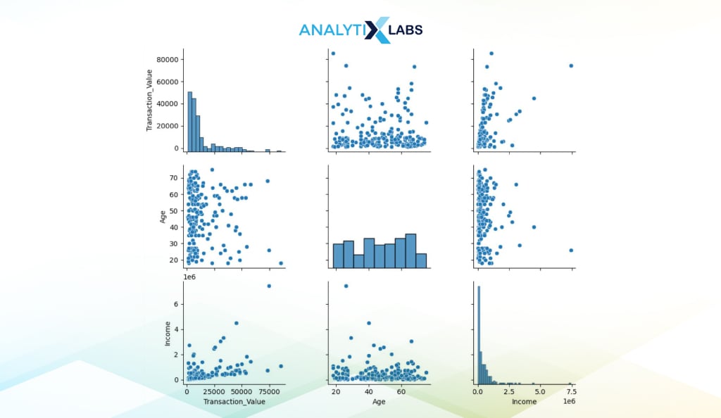
Pair Plots
Pair Plots refer to a matrix of scatter plots and histograms for numerical features. The availability of all such graphs in a single view allows you to quickly assess the relationship between them.
You can easily create a pair plot using Seaborn. Below, we extract three numerical columns in a separate dataframe whose relationship we want to analyze. We then pass this dataframe in the pairplot() function.
# extracting columns
data = df[['Transaction_Value', 'Age', 'Income',]]
# creating pair plot
sns.pairplot(data)
Conclusion
Python has some of the most powerful visualization libraries. While the plot attribute can be used for simple, straightforward visualization of Pandas data frame, Matplotlib’s Pyplot and Seaborn are the best libraries for more complex graphs.
There are a few more kinds of graphs that you should explore. Geospatial data can be visualized using the library Folium, which allows users to create choropleth maps and maps with markers. To visualize text, you can create Wordcloud using libraries like WordCloud, WordCloud2, and even Matplotlib.
Python also allows you to create interactive graphs using libraries like Plotly, Bokeh, and Altair. Lastly, you can explore creating a dashboard in Python, where libraries like Plotly and Dash can be of great use.
FAQs:
- What is data Visualisation in pandas?
Pandas dataframe, and Series have the attribute ‘plot’ that allows you to perform visualization in Pandas. Using the argument ‘kind,’ various graphs can be easily created.
- How do you Visualise image data in Python?
Images can be visualized in Python, where images are first imported and processed using methods like PCA. Then, scatterplots are created using Matplotlib to understand the features of the images.
- How do you visualize a dataset?
In Python, libraries like Pandas, Seaborn, or Matplotlib can create various kinds of graphs, such as bar charts, pie charts, histograms, scatterplots, etc.
- When to use Matplotlib?
Matplotlib should be used whenever you wish to create subplots or non-standard plots that require low-level plotting (i.e., plotting of individual points, lines, etc.)
We hope this article helped you expand your understanding of visualization in Python. If you want to learn more about Python and its visualization libraries, we have the best resources for you!
- Understanding Exploratory Data Analysis in Python
- A Guide to Data Warehouse: Definition, Concepts, Types, and More
- What are the best Python Libraries for Machine Learning to learn in 2024?
- How to Read CSV Files in Python?
- Why Use Python For Data Analysis?
- Top 50 Python Questions for Data Science Interviews 2024


![How to Perform Data Analysis using Python – A Case Study With Sales Data [Codes Included] data analytics using python](https://www.analytixlabs.co.in/blog/wp-content/uploads/2024/09/Cover-Image-1-2-370x245.jpg)


