Famous author R.A. Earnshaw defines Data Visualization as a, “visual medium concerned with exploring data and information in such a way as to gain understanding and insight into the data. The goal of data visualization is to promote a deeper level of understanding of the data under investigation and to foster new insight into the underlying processes, relying on the human’s powerful ability to visualize.”
For example, a line plot for number of unique visitors on a website over last several months; will give important traffic related insight to growth marketing team and help them to design their campaigns effectively. Similarly a heat map made out of international migration data, will assist think-tanks and policy makers in effective human resource management and international regulations.
This article presents a non-exhaustive list of the key terms associated with Data Visualization.
Infographic
Infographics (also known as Information Graphics) are a medium to represent data and information in a visually graphic manner. Infographics are usually designed for the purpose of mass communication and therefore are fundamentally different than other form of Data Visualization. They utilize graphics to grasp viewer’s attention and enhance the viewer’s ability to spot patterns, trend and other insights from the data. The objective of graphics display is to show the data and compel the viewer to focus on the substance of the infographic, rather than the graphic design. Infographics can present large data sets in a small space and coherently. Infographics often present comparison between different pieces of information and data; and is complemented with statistical and verbal description of the data sets.
There are several online tools to create infographics; some of the notable ones are:
Geographic Visualization
Also known as Geovisualization, it refers to a set of techniques and tools that are used for geospatial data analysis, as a form of interactive visualization. Geovisualization translates geospatial information using Geographical Information System (GIS) [This term will be discussed later in this article]. Geovisualization allows for interactive and dynamic maps, which includes the chance to analyze different layers of information, and the ability to change the visual appearance of the map.
This branch of visualization involves usage of cartographic technologies and techniques that can render maps in real time. Geographics Visualization has utility in the discipline of Wildlife fire monitoring, Environmental Studies, Oceanography, Urban Planning, etc. One of the most notable usage of Geographic Visualization is the time lapse of polar ice caps along with annual global temperature, as a measure of Global Warming.
Bar Graphs
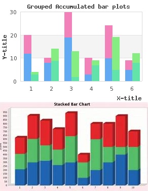
Bar graph is one of the foremost Data Visualization tool, that displays grouped data with rectangular bars whose lengths are proportional to the magnitude of their respective variable. Bar graphs displays the relationship between two variables, and a vertical bar graph can be called as a column bar graph. Bar graphs are mostly used to measure comparison between two categories over the similar variables. In any bar graph, one axis shows the discrete value and other axis represents the specific category being compared. Bar graphs are usually scaled to fit the entire dataset into one graph.
There are two categories of bar graphs:
- Grouped Bar Graph
In a grouped bar graph, there are two or more graphs for every discrete value, representing different categories. For example, an online retailer can plot grouped bar graph for two products; number of sales on y-axis and weekly days on the x-axis. This can be done to compare which product performs better on which days of the week. - Stacked Bar Graph
In a stacked bar graph, the results from different categories are compiled on top of each other to show a cumulative result. Each bar stacks are colored coded to evaluate their proportional contribution in the sum total.
Pie Chart
Pie chart is a circular statistical graphic, which is divided into arcs and the angle of these slices (or the arc length) is proportional to the magnitude of the respective variables. Even though Pie Charts are widely used in Media and Business Industries, its utility is disputed by statisticians on the grounds of effective data translation, visual perception and comparison between variables. There are several different types of Pie charts, such as mentioned below:
- Doughnut Chart
- Exploded Pie Chart
- Polar Area Diagram
- Multi-level Pie Chart
Spark Line
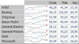
 Sparkline are small line charts, which are usually drawn without coordinates or axes. The objective of a sparkline is to visualize the general outline of the variation (with time or any other variable) for some measurement units like air pressure, stock price, temperature. Sparkline is a simple and condensed data visualization tool; not only can they be embedded within text, but sparklines of several variables can be combined for comparison. Sparkline are not required to contain the entire data, rather they are intended to wrap in the text and to be succinct.
Histogram
Histogram are a data visualization medium for the representation of probabilistic distribution of numerical data. A beginner may confuse them for a bar plot, but in reality they are an estimation of probability distribution of quantitative variables. In order to plot a histogram, the entire range is divided into series of equal intervals, called bins. These bins are non-overlapping and consecutive intervals. The y-axis of an histogram represents the probability density, which is number of cases per variable unit on the x-axis.
In a histogram if the bins are of equal interval; then the length of the rectangle erected over that interval is proportional to the frequency. However in histogram where the bins are not of equal length, the area of the rectangle erected over every interval will be proportional to the frequency; number of cases in that bin.
Pareto Chart
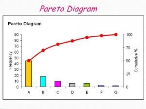
 Pareto charts contains both line and bar graphs, where bar graphs are arranged in descending order to represent the individual values of the variables, and the line graphs is drawn to show the cumulative total of all the variables. The left y-axis in a pareto chart can be unit of measure, cost or frequency of occurrence. The right y-axis represents the cumulative percentage of the total of that particular unit of measurement. If the bar graphs in a Pareto chart are arranged in ascending order, the cumulative function will be a convex function.
Pareto charts are used to highlight the most important factors. For example, a manufacturing business can make a pareto charts to measure the reason behind defected pieces. Each bar can correspond to different factor behind the product defect.
Heat Maps
Heatmaps are graphical visualization of data and values, that are contained in matrix and are color coded. These are two dimensional representations of data, in which values are represented by colors to provide a succinct visual summary of the information. Different color schemes are used to communicate the correlation between data values in a heatmap. For example, in any US presidential election, a heat map will can display the winning party in each state. Similarly a Web heatmap can be created to display areas of a webpage that are most often scanned by visitors.
GIS
GIS stands for Geographical Information System, it is a framework designed to store, capture, analyze, manipulate, visualize and manage all kinds of geographical and spatial data. GIS can visualize data and information by using location (geo-coordinates) as the key index variable. GIS is a separate branch of sciences which focuses on Geo-data translation, data capturing, raster to vector translation, coordinate system, projection, etc. GIS based data visualization has numerous applications in Hydrological Modelling, Topological Modelling, Cartographic Modelling and Geo-data mining.
Timeline Chart
Timeline chart is visualization of temporal data in chronological order. Timeline charts are used for spotting trends by showing data/variable over time. X-axis of a time chart contains data/time and y-axis has other variables. Data presentation in a time chart can be done using either lines or bars with same or different scales. The essential characteristic of such a chart is that on the horizontal axis, time dimension is plotted linearly; which allows user to scroll along with timeline and zoom in/out of any time period.


2 Comments
We’re a gaggle of volunteers and opening a brand new scheme in our community.
Your site offered us with valuable information to work on. You have
performed a formidable job and our whole neighborhood shall be
thankful to you.
What’s up, the whole thing is going nicely here and ofcourse every
one is sharing information, that’s genuinely fine, keep
up writing.