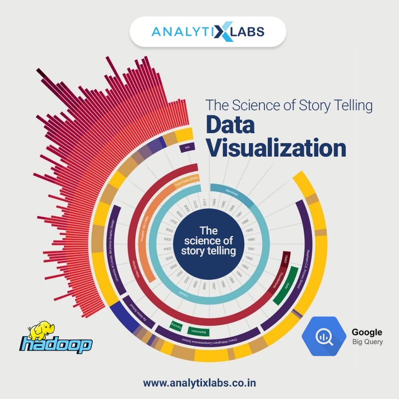
Do you ever wonder how all the traffic or weather condition in your city is viewable in one picture? Or about animated data in real space?
Data Visualization with its visual story telling abilities, is enabling more engaged interactions and decisions. The application of Data Visualisation resonates with multi-variate users – while on one side it maybe for the decision makers in a boardroom there on the other side even better, for children in a science museum.
At no point in past it has been truer than now that “A picture is worth a thousand words.” Only this time from an art form, visualisation is slowly becoming a science with the advent of multitude and varied forms of data.
Data Visualisation is for modern Business World
As per “10 Key Marketing Trends For 2017,” – a report from IBM Marketing Cloud –
about 90% of world data was created in the last two years around 2.5 quintillion bytes per day! And with newer technologies this data will witness accelerated growth in coming few years.
Paradoxically, one of the boon and bane of digital disruption has been its ability to generate trillions of data – Big Data. Boon because it gives abudant valuable data points which can be analysed for better business decisions. Albeit, the problem erupts because while the premise shared before is true for the structured data, there, for unstructured data – which is about 80% of total data- it sometimes is a challenge to draw a more accurate conclusion. Here Data Visualisation comes in as a saviour, which is making even the understanding of unstructured data information possible; previously considered elusive to learn from.
Besides enabling easier decision making, Data Visualisation has also made accessibility of data possible to greater range of people with its easy comprehension ability. Progressive organisations today are visual organisations. They are encouraging a culture for asking better questions on data through visualisation and are hence, making better business decisions. Employees are being asked to present their case and make their decisions based on data. Data oriented decision is the norm and has permeated the business world of today.
Data visualisation tools – A key to encouraging data driven business culture
At the very foundation level excel still rules with its basic abilities like creating simple graphs, bar charts and pivot tables, there, more advanced and sophisticated tools are already there which are capable of much more. IBM, Cognos, SAS and other enterprise Business Intelligence tools have been around for sometime, however, they are not the only ones. Business Objects, Qlik and Tableau are the ones to look out for their sophisticated user experience. While they are all being preferred over the older generation tools, there, Tableau is clearly leading the new pack.
The Tableau Advantage
Tableau does not cost much and has an excellent user interface making it one of the most preferred Data Visualisation tool in the business world. Other advantage of Tableau is that it works out very well for detailed analytics. Its integration with third party big data platforms like Hadoop and Google BigQuery API speaks about the advanced nature of the tool. Further the responsive attribute of Tableau dashboard gives an excellent experience to the users on mobile devices; a much required feature when ~60% or more online traffic comes through mobile. In addition, its upgrades are more easy to execute.
Over all while all the visualisation tools are making data come alive through visual stories there probably Tableau is making it more accessible to larger audiences.
The science of story telling
Advances in multi-dimensional imaging and few more factors are qualifying data visualization as a science versus an art.
Usually learning of data analytics goes through descriptive, predictive and prescriptive phases. Beginning of descriptive analytics journey starts with data visualisation or by telling a substantive data story. This substantive nature of data visualisation makes the messaging and communication of data very effective.
Additionally the data visualisation also needs to be contextually accurate. An absolute data can be misleading without a complete picture of other relative figures that are connected, which, Data visualisation makes very possible. While data analytics is the future, there, even more valuable is data visualisation for its ability to facilitate more accurate decision-making. This has been a reality through bringing big picture of actionable insights live and hence,making Data Visualisation the very heart or foundation of analytics.
Being the main architect in presenting huge data analysis it is finding relevance across the board. You maybe a big data expert or a data scientist or a non-analytics manager, eitherways you will need to know the science of visual data story telling to make your point. Through accurate and comprehendible visuals, data visualisation is making possible absorbtion of information faster for everyone alike.
So next time when you win accolades at work for making a compelling point through the science of story telling do share your data visualisation success story and for those of us who would like to learn the science of story telling do look out for our next batch on Data Visualisation and Analytics
Reference:
http://analytics-magazine.org/data-visualization-the-future-of-data-visualization/
https://www.sas.com/en_us/insights/big-data/data-visualization.html
http://www.huffingtonpost.com/phil-simon/the-increasing-importance_b_9837722.html


1 Comment
Hi,
Well! The blog is very good and the explanation about the visualization is so good. I felt the blog is really very good. Thank you for sharing such an informative blog.